As we reported earlier, Apple has finally unveiled the redesigned Apple Music app which will come as a part of iOS 10. Numerous website already posted images of how the new app looks like. It seems like the app brings numerous changes, many of them visual, but also a couple of new features as well.
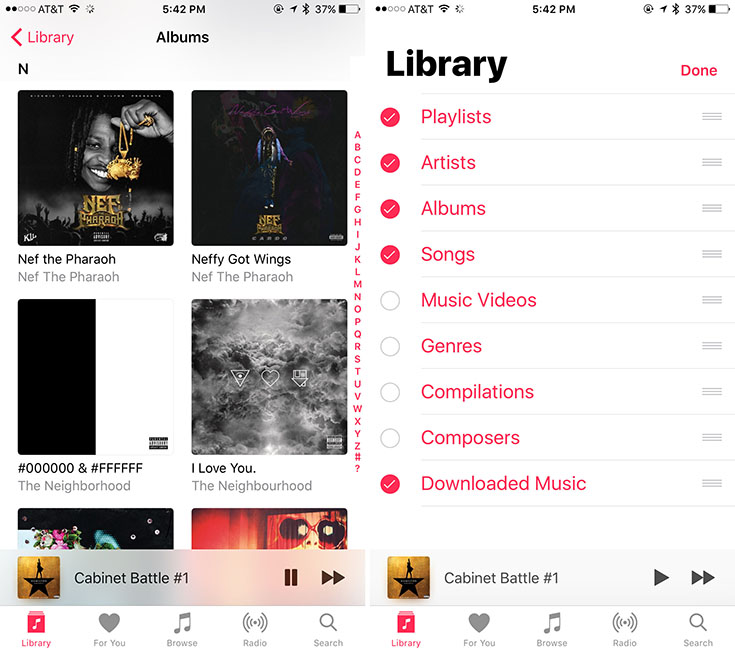
The main screen of the new Music app is the “Library” tab, which shows all the music you’ve added to the local storage. The new “Edit” button, which can found next to the very bold “Library” heading allows you to filter the content.

Interestingly enough, the Library shows only your recently added content and it requires a couple of extra taps to reveal the entire content.
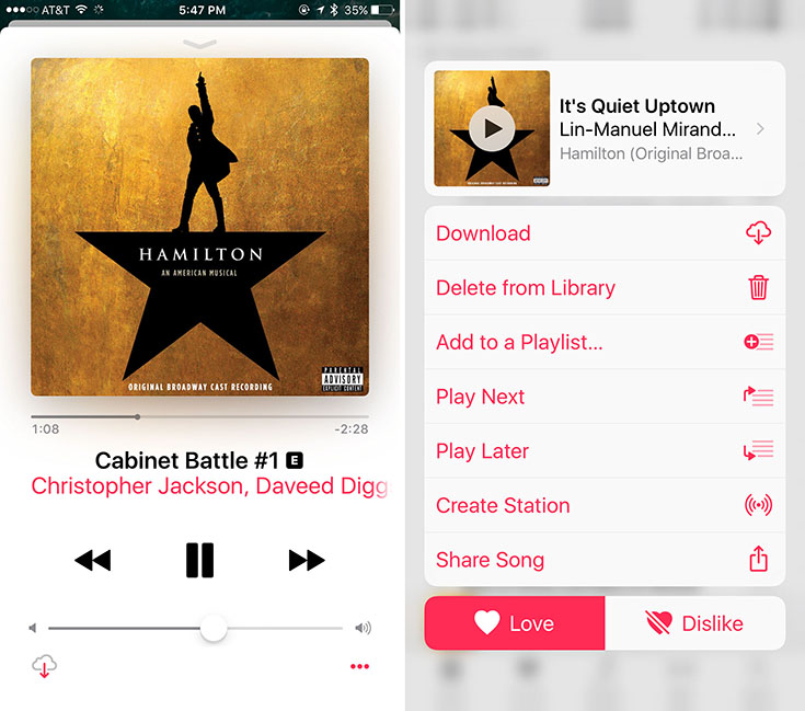
The album page remains pretty much the same in iOS 10 as it has been, even though there are some subtle changes. For example, the three dots that allowed you to add a song to the queue or share it are no longer there.

The new Music app also clearly shows whether a song has been downloaded for offline listening. There is a “Downloaded” indicator in bright coloring. The Now Playing screen now looks like a stack of cards, which is also a nice little visual treat.
The new Apple Music app if heavily focused on bring and bold colors, which has its pros and cons. However, we expect for the UI to be refined until the final iOS 10 version ships to customers. It is expected from the final version to become publicly available in the fall, alongside the next-generation iPhone.


