Even though it seems like there are already too many photo editing apps in the iOS App Store, developers are still trying to bring their own version of the perfect photo editor. What this means is that there are numerous amazing apps, most of them free of charge or priced as low as $1, which is amazing for iPhone and iPad users interested in digital photography. I believe these apps are here to stay and since almost everyone has their own photo editor of choice, there’s always more room for improvement.
In this article we are going to take a look at Filters for iPhone ($0.99), made by Mike Rundle. According to the official description which says that “you don’t take photos with Filters. You transform them”, and since there are apparently over 800 filters to choose from, this is one of those apps that we simply had to try for ourselves. Continue reading for our full review.
Upon researching about Filters for iPhone, I’ve learnt that Mike Rundle wrote the code of this app and designed the interface, which actually shows through. Unlike most other apps, where we can see inconsistencies throughout their UI, Filters brings a very unified interface.
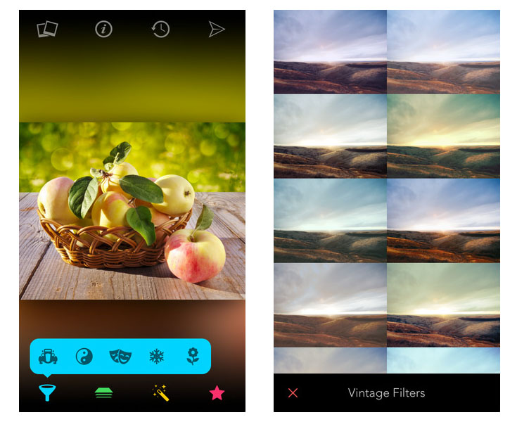
For an app that is promising to bring numerous capable tools, Filters is surprisingly simple and intuitive. There’s actually only one canvas view. Upon the initial launch you’ll see the top row of icons, where you can import and export images, as well as undo actions and find help if needed. As it has been said before, you can’t take photos using the app, but only import them. However, there’s no way to crop or rotate images, so you might want to use Apple’s Photos app for these basic adjustments. However, I hope we’ll get to see these features added in the future.

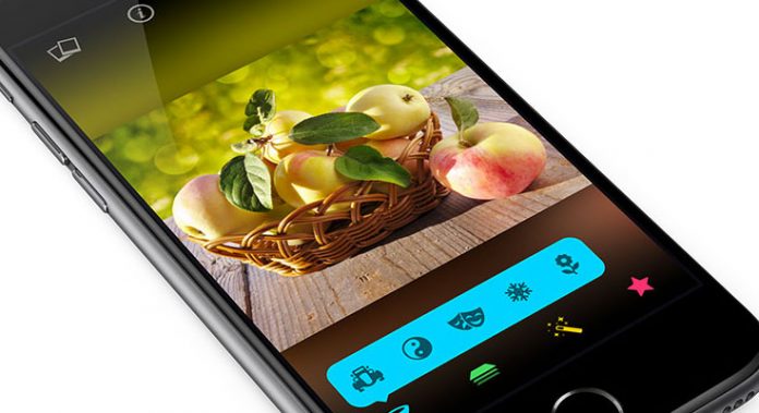
The bottom row of icons is where you’ll spend most of your time. These are four main groups of tools: Filters, Overlays, Effects, and Favorites. There is an interesting animation when you press any of these buttons and open a new menu, since they gently slide into place with a nice spring. This animation can be seen in some parts of the app, which is what I was referring to when I spoke about this app’s unified experience.
No matter which tool you decide to use (Filters, Overlays, or Effects), once you click on an icon you’ll open a popover tray with subcategories to choose from. Since there are 800 effects, it would be impossible to navigate through without having a set of subcategories. Each effect is numbered, so you can easily remember you favorite ones, but you can also move them to your favorites list – great for a quick access. There’s no search functionality, which is something that’s really missing at this point.
When it comes to available set of filters, it is an understatement to say that there’s plenty to choose from. There are five main categories: Vintage, Monochromatic, Dramatic, Cool, and Warm. When you pick a filter, you’ll see the intensity bar, which is where you can see how much of the effect is applied. You can also long-press on the image to compare the current state to what the image looked like in the beginning. You can confirm to apply using the green tick button, but you can always use the undo if you decide later that you’re not happy with the chosen effect.
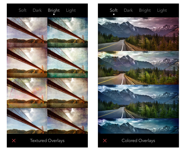
While you can choose from 500 filters, you can also choose from 300 textured overlays. It is interesting to see how images change when filters and overlays are combined, and most of them are able of creating professional-looking results. You can choose from textures, lights leaks, and colored gel overlays and combine them using one of four blend modes. The possibilities are endless. However, you can’t rotate overlays and fine-tune them in order to position them how you exactly want. An application like Pixelmator is quite capable with these operations, but this app comes with a higher price tag, so I guess that many photography enthusiasts are going to be perfectly satisfied with Filters’ overlays.
If you click on a magic wand icon in the bottom-positioned toolbar, you will be able to perform some basic adjustments. These are called “effects”, but what you’ll be able to do is to adjust brightness, contract, color temperature, exposure and saturation. There are also five additional adjustment tools called Shine, Luna, Intimidate, Color Boost, and Smart Fade. These tools are certainly interesting, and they produce nice-looking results, but with certain images they can be useless. Well, you can always try and play with them, so if you don’t like the result you can always undo it.

Once you are done editing, you can save the image to your Photo Library, or send it to Instagram. There’s also the iOS’ Share Sheet, so you can continue editing your app in another editor by using third-party extensions. This can be useful is you need to add some type of text to your images, since Filters for iPhone can’t help you with that.
There’s no doubt that Filters for iPhone will become instantly popular, even in today’s overcrowded market of iOS photo editors. If you take a look at the App Store, you’ll see that you can hardly find more than 800 preloaded filters for the price of $1. There are no in-app purchases, so what you can see if what you get. With this said, in case you’re searching for the next great photo editor for your iPhone, look no further than Mike Rundle’s Filters for iPhone.
[ad name=”Google rechthoek”]


