Even though many of us use Apple’s Safari for all our Web browsing needs, this might not be the most usable Web browser for everyone. For example, some of us are using Chrome for its speed and numerous extensions, even though this browser can be very hard on battery life.
I like to switch between different browsers and test them before I decide to use a certain one a daily basis. This is why I felt excited when I saw a new browser become available, which promised to bring a lot of innovation. I am talking about a recently released Vivaldi, which comes from some of the creators of Opera. Continue reading to learn more about this Web browser, which kind of adds a layer of Opera on top of Chrome. Sounds interesting, right?
We present you: Vivaldi
I think it’s safe to say that many browsers trade-off between ease of use and customization. However, Vivaldi doesn’t and that is its biggest selling point. This browser is trying to bring as many useful and innovative features without being overwhelming. In fact, it is highly customizable as well.
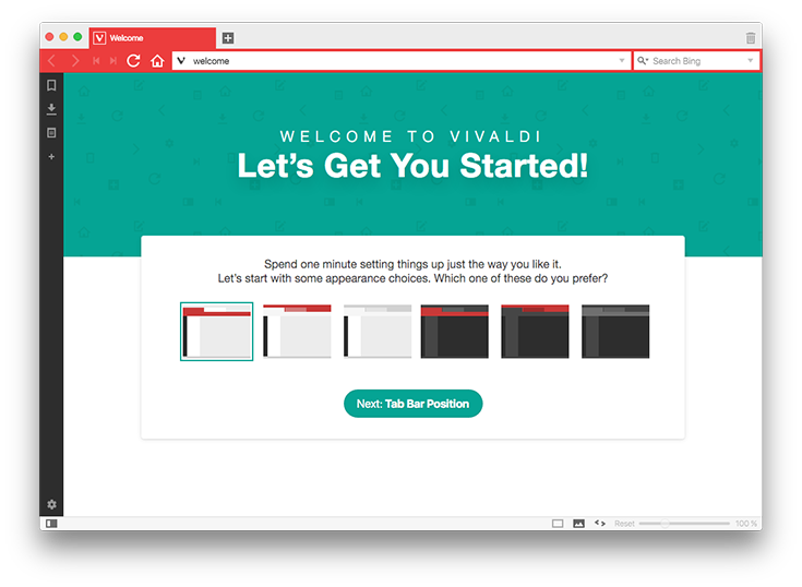
Upon the initial launch, you will be asked to go through a process of setting up Vivaldi according to your needs. This is a very simple and elegant process, even though you can go back at any time and make any kind of adjustment. The browser comes with clean and nicely presented Preferences, where you can fine-tune your browsing experience.
UI Design
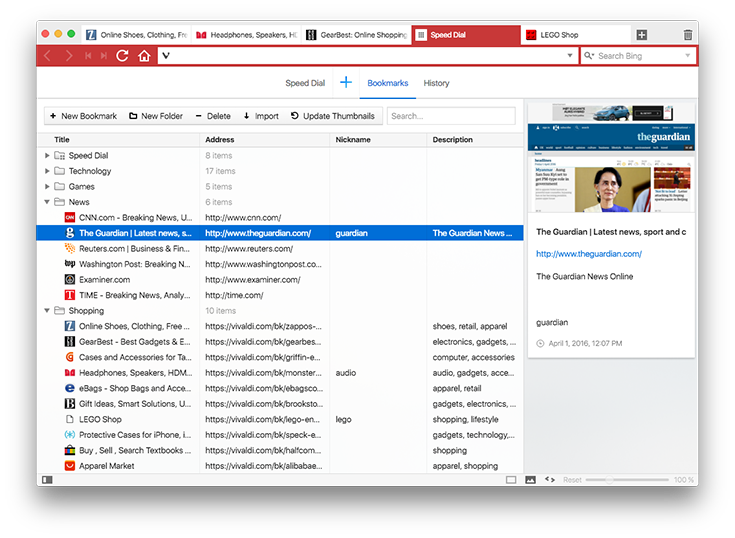
When it comes to its UI design, Vivaldi has definitely made an effort to look different. I wouldn’t say its UI is radically different but different enough to make its own visual identity. For example, the tab bar changes color to match the dominant hue of the current page, so you can easily and quickly differentiate pages. In addition, it brings a very interesting page-loading interface. As the web page loads, the progress bar advances through the background of the URL bar, along with a percentage and the number of total page elements loaded. Once the page fully loads, these numbers will disappear.
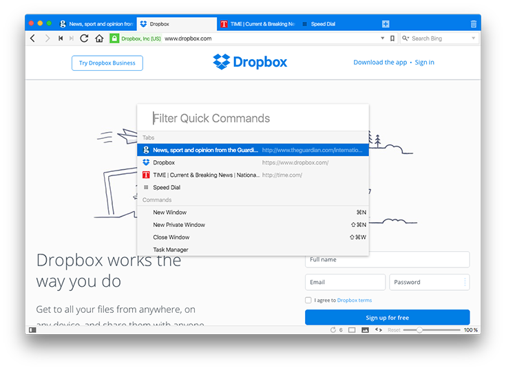
Most popular Web browsers tend to look the same, at least in their most prominent visual features. There are typically brutalist icons that are placed onto a gray background. A bit of color wouldn’t be such a bad idea, right? Well, here’s what Vivaldi can offer. Aside from different theme like colors, you can adjust almost every possible design element. I was surprised by how functional it can be to push the URL bar onto the bottom of the window.
Features
Even though you can make Vivaldi very simple-looking, there are numerous helpful features hidden all over the application. For example, a Quick Commands prompt can be summoned via keyboard shortcut, which lets you jump between tabs. A sidebar can be used to show bookmarks and searchable download archive. There is also a Notepad which lets you create your own short reminders and notes.
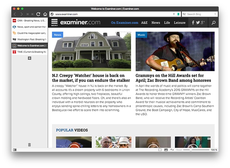
Even though I think many of you will find the Notepad to be useful thanks to its ability to save notes, snippets of web pages and images, I found it to be problematic performance-wise. I am not sure why, but this feature caused several issues and one crash. I guess this part of Vivaldi deserves some more attention.
I would also like to highlight another featured called web panel. It can be accessed from the left side of the screen and acts as a vertical sidebar. You can use it save a couple of web pages, which will then be opened in the sidebar. However, Vivaldi cleverly asks for the mobile version of the page, so you will see content optimized for the sidebar space. I would like to see this feature expanded with RSS and automatic refresh.
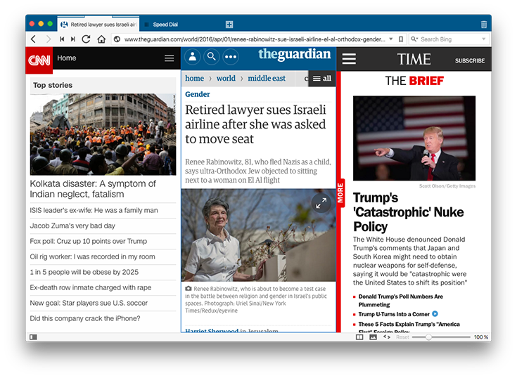
Finally, I must take this chance to point you to towards numerous other, but smaller features. These can be found at the tiny page tiling icon, in the lower-right corner. This is where you can find several “page actions”, where some of them can be very useful, while others are quite peculiar. There is an option to change the background color, as well as to un-focus elements of the screen that you’re not interacting with. You also have to try to option to turn the page into faux 3D objects. I think this only shows that some serious work was put into this application.
Chromium Influence
As said before, Vivaldi is built on Chromium. This can be seen by different page elements, even though it is also clear that Opera had a lot of influence onto this browser. The best thing about being built on Chromium is that you have the Chrome web store, where you can find thousands of highly useful extensions.
In addition, some features (or extensions) come preinstalled, like Adobe Flash. However, Vivaldi allows you turn them off in case you’re worried about performance or security.
Performance
When it comes to its performance, this is where things could be a bit more polished. When it comes to different benchmarks, this browser falls somewhere in the middle, with the exception of HTML5 standard compliance, which is top-notch.
In addition, I could hear my MacBook’s cooling fans kick in during browsing, which means that Vivaldi isn’t exactly light on resources. Once I switched back to Safari, cooling fans were quiet once again.
Conclusion
Personally, I find Vivaldi to be highly interesting. This browser seems to be on the right track and I am sure we will see numerous improvements and enhancements soon enough. Vivaldi has a potential to enhance your daily Web routine.
Even though I think I will still continue to use Safari as my primary web browser, I will also leave Vivaldi in my Dock in order to check its progress. We definitely have another very serious player when it comes to web browsers, and I think Vivaldi will make a big impact in the future.


